Squarespace Footer: What Do I Put in a Footer Section?
What is the Footer Navigation in Squarespace and why is it important? What do I put in a Squarespace footer?
A footer is a magical place that holds so much information! With the main and secondary navigations getting cleaner and less cluttered the footer takes on the heavy lifting and holds all the extras that your audience might need.
Website savvy audiences know that the footer has all the contact information they need. They also know that the footer usually has social links and they illusive contact button. They want to get in touch and clients know to scroll down!
So what do I put in a Squarespace footer when I’m designing websites?
Main & Secondary Navigation
Giving your guests a quick way to choose your most important links at the bottom of your website is a great way to keep them on your page. Adding the Main and Secondary Navigation links to your footer is a must.
2. Copyrights
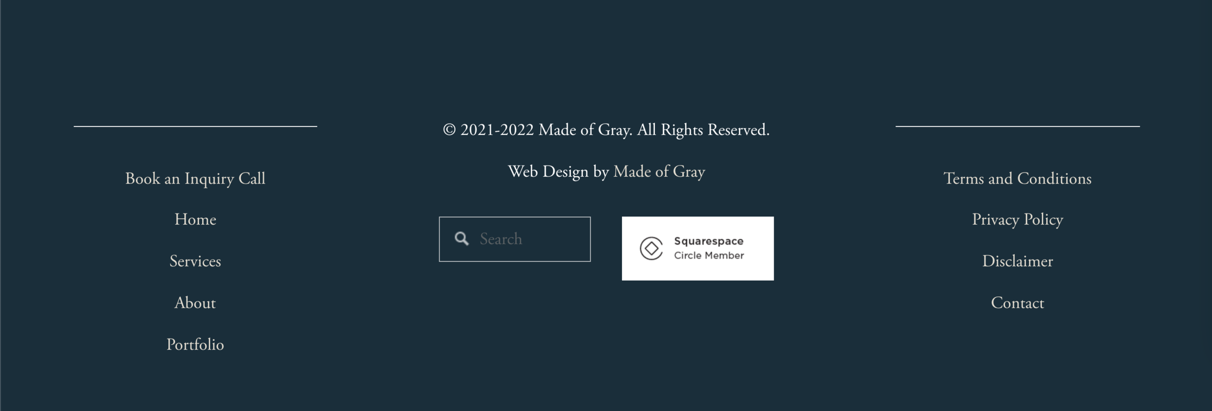
This is where you add your copyright information! You created it so it is best to claim it. By adding the © symbol you are telling the world that everything on each of your website pages is your creative property. Here’s an example of mine:
© 2021-2022 Made of Gray, LLC. All Rights Reserved.
I’m a fan of adding a span of years instead of the current year. This shows longevity and covers all the content written previous to that year. Don’t forget to add the new year on January 1, 2023!
3. Contact Info/ Physical Address
This is where you add a link to your contact page, discovery call link or physical address. When you make your contact information hidden in your main navigation you can add it to the footer. Have a physical address? You definitely want to add this to your website footer. Have a business phone number? Add it as well. Anything you can do to get your customers and clients headed your way is a great thing!
4. Credits
Credits generally go in the same area as your copyright. This is where you give your web designer a shout-out or your photographer their photo credit. Anyone whose work is featured on your site. Linking to them in this area is a HUGE help in the eyes of SEO (Search Engine Optimization) and search engine happiness. You love your design or photos so give credit where it’s due. If your design and photos are all yours then give yourself an internal link and pat on the back.
This is an example of mine:
Web Design by Made of Gray (Well, of course!)
5. Legal Pages
Hello. Not a lawyer! This, my friends, is the kicker. If you have a website you’re going to need some legal pages. In general Terms and Conditions, Disclaimer and a Privacy Policy. All of these can live in your Squarespace website footer. Each of these legal pages serves a different purpose.
In general, if you are using cookies, analytics of any kind, accepting emails through a newsletter signup, or selling a product or service you need these legal pages in your footer. Pretty much everyone, huh? You can find legal pages as cheap as $30 or as high as $400. It really depends on what you want and how often you feel comfortable updating. Whatever you decide, pop the links to them in the footer.
6. Social Links
Squarespace is great with social link icons. Add these to your footer so that everyone can find out what you’re doing across the web.
7. Social Feeds
The most common social feed to add to your footer or pre-footer is an Instagram feed. Generally, this is a horizontal grid that is customizable and keeps up with your Instagram posts. Just another way for your clients or customers to keep track of your activity.
8. Newsletter Link
Are you collecting emails and asking for newsletter signups? This is the place to add a link and maybe a form field for your newsletter. Adding a newsletter signup to your footer ensures that it will be present on each of your website pages no matter where your audience is clicking.
9. Business Biography
Do you have an elevator pitch that is concise? Adding a business biography to your footer in a short and quick text block is the way to go in a Squarespace footer. Not only is it SEO friendly it can help your audience decide if you’re the perfect fit.
10. Logo
Proud of your branding and logo design? Add your logo to the footer to boost that brand recognition!
11. Search Bar
Sometimes your audience needs to know something specific and they don’t want to click around trying to find it. Give them a search bar in your footer and they will be super pumped. Plus you can see what people are searching for and this will give you valuable insight to cater content.
So what are you waiting for? Pick and choose the most important aspects of your Squarespace footer and pre-footer. What counts for your audience?
The main and secondary navigations located in the header are getting cleaner and less cluttered. This is a design trend that is surely going to stick around for a long time. The footer and pre-footer take on the heavy lifting and hold all the extras that your audience might need.


